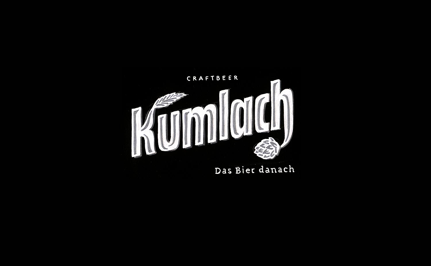
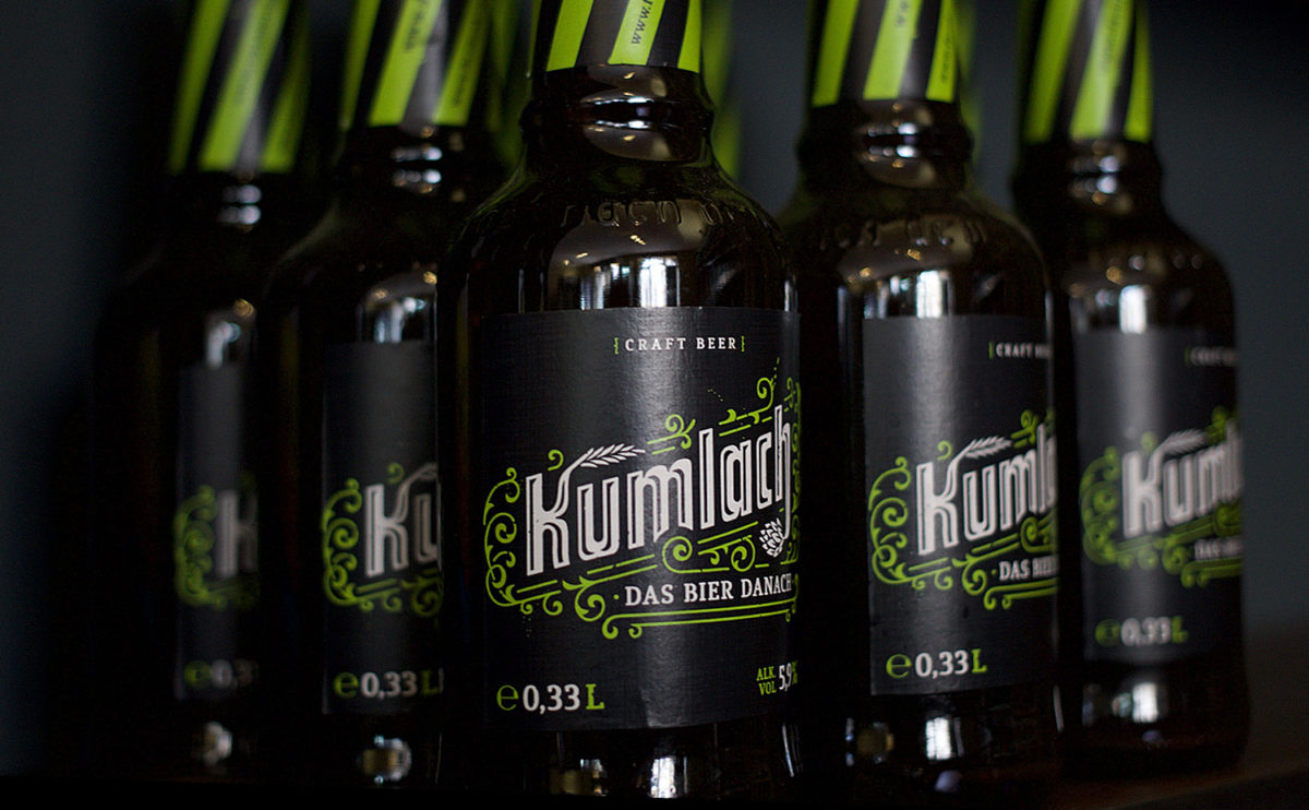
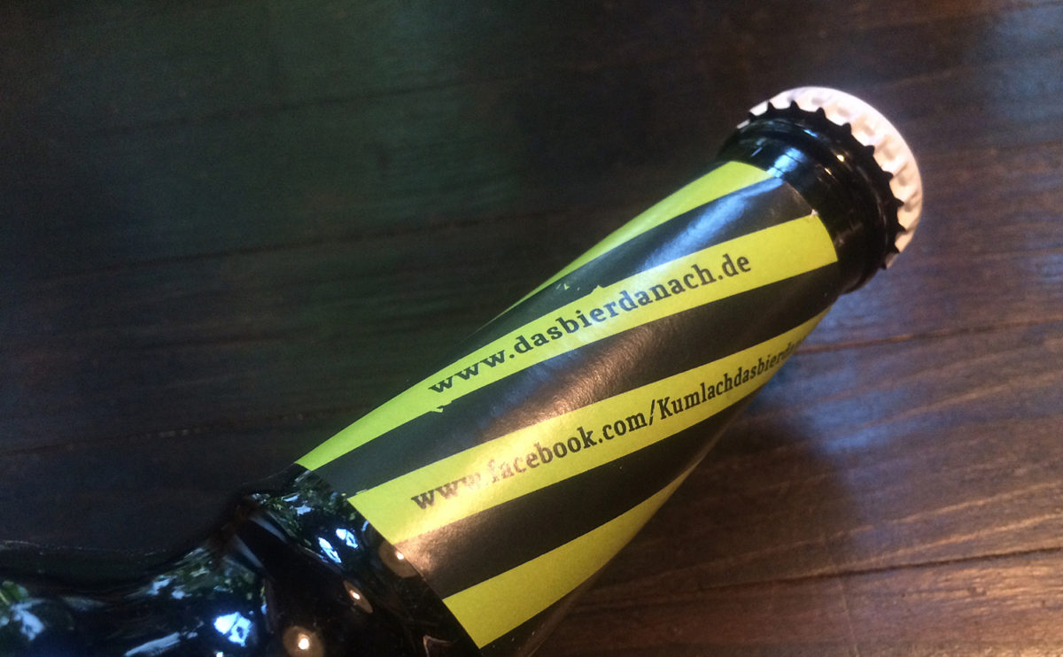
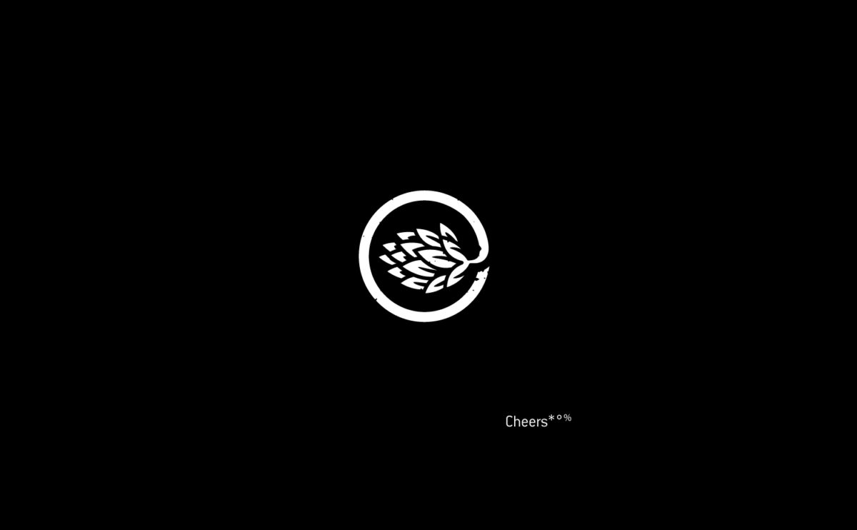
I was asked to deliver a brand packaging for a tasty german craft beer Kumlach – das Bier danach. The branding was a lovely pro bono project where i created a kinda grown wordmark in hand lettering. Hops green ornaments frame the entire wordmark and on its ascender and descender letters there are the two main ingredients shown—barley and hops. The striped brand pattern comes from the way of growing hops because the poles whereupon it is grown usually have an angle of 70° tilt. I also created a hops picture mark, a tiny brand iconography for when to drink the beer as well as a drinking recommendation for the brand packaging. ~ Cheers*
CREDITS
Client: Kumlach Craft Beer
Agency: ART ARMINUM
Discipline: Art Direction, Brand Packaging, Hand Lettering, Ornamental Design, Graphic Design, Iconography
Photographs: Dirk Fern Friedel
Commercial: Anton Polinski
URL: dasbierdanach.de