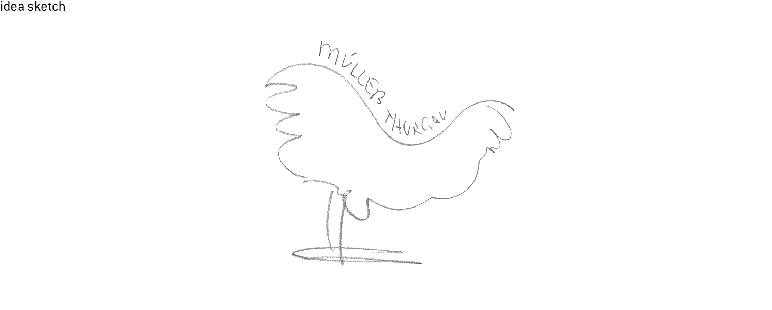
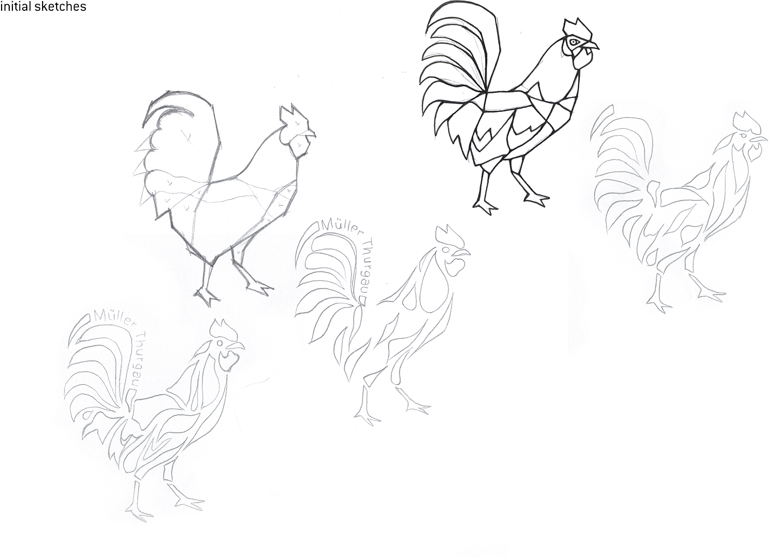
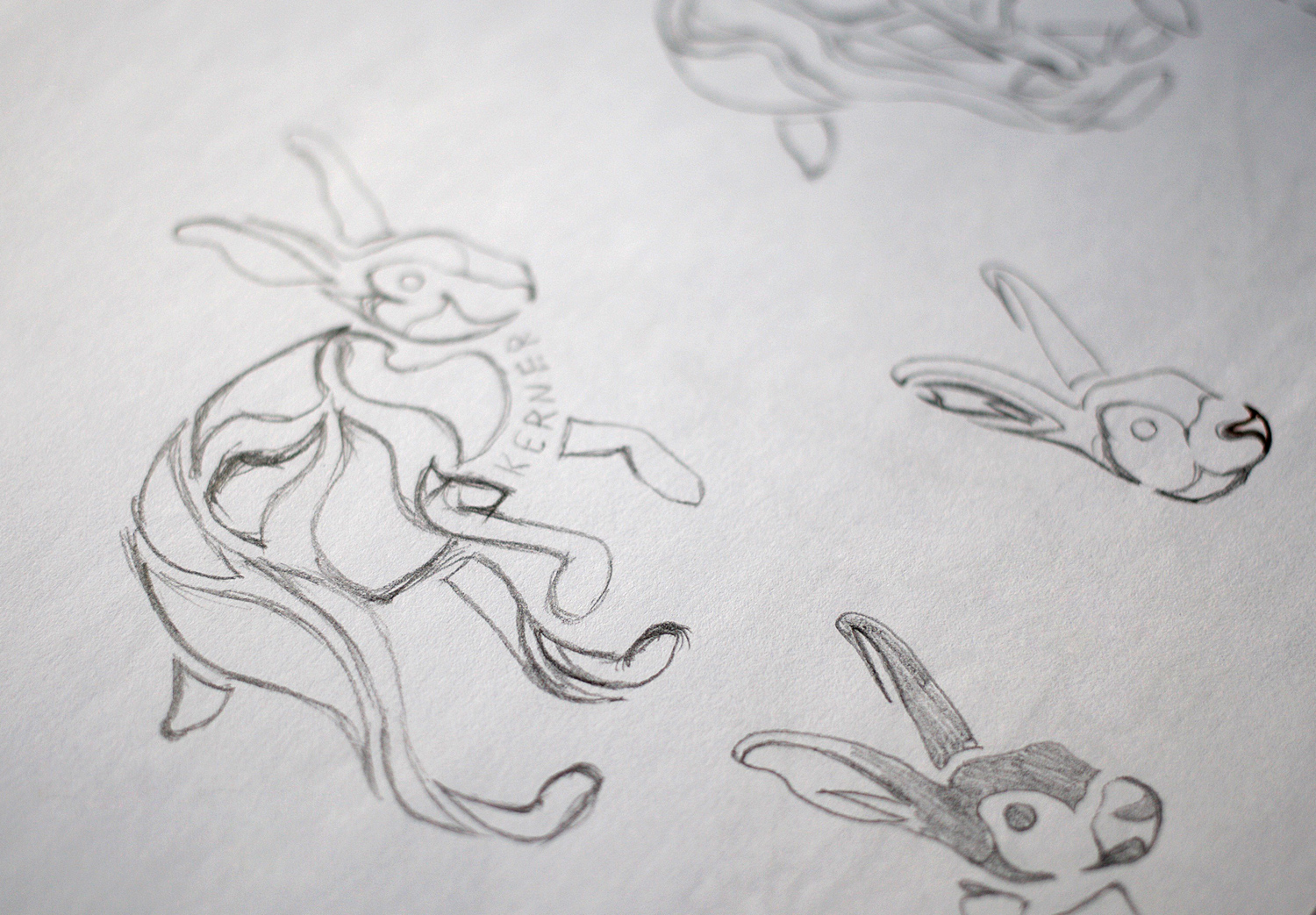
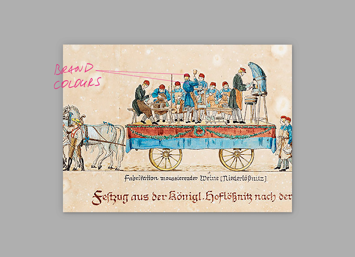
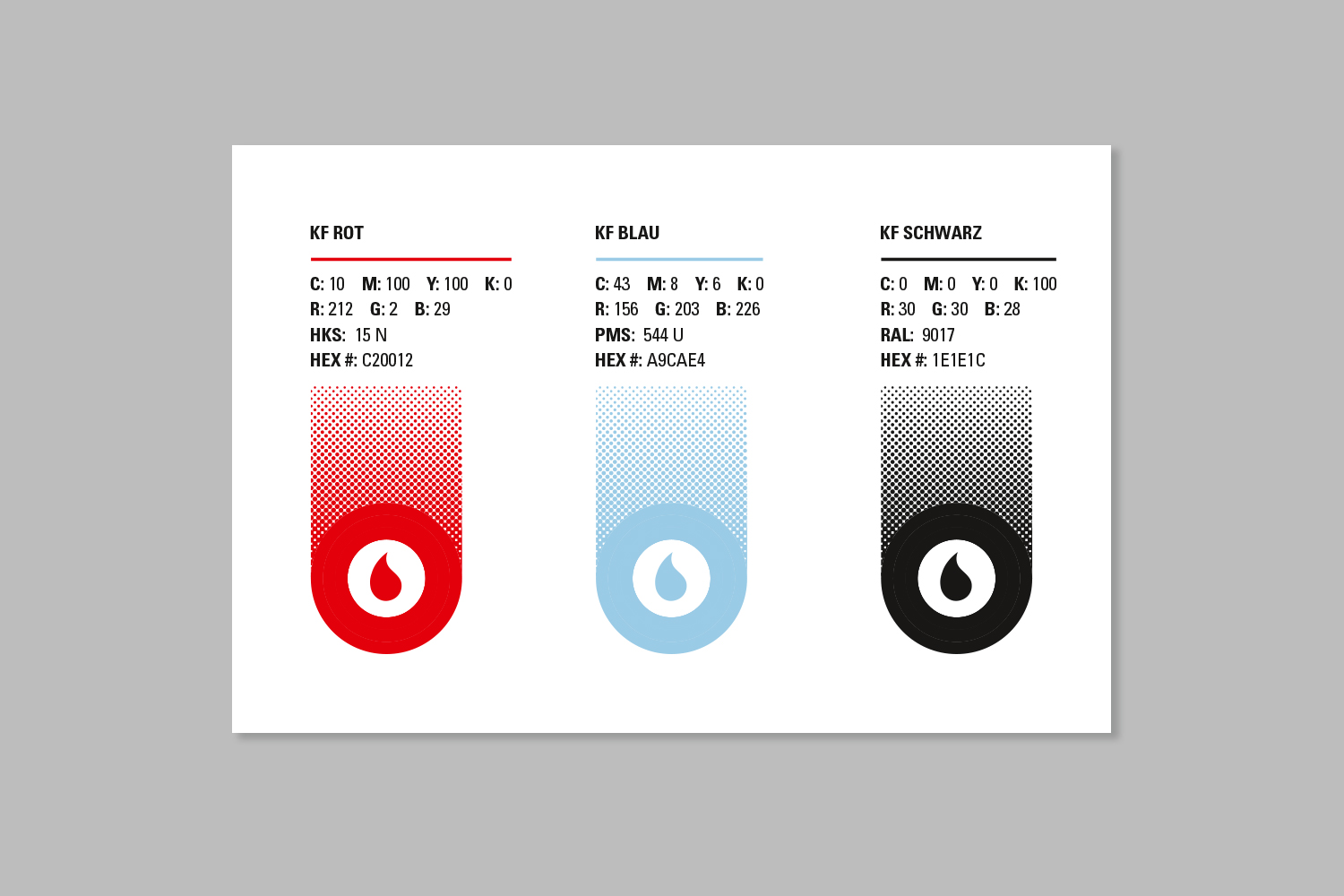
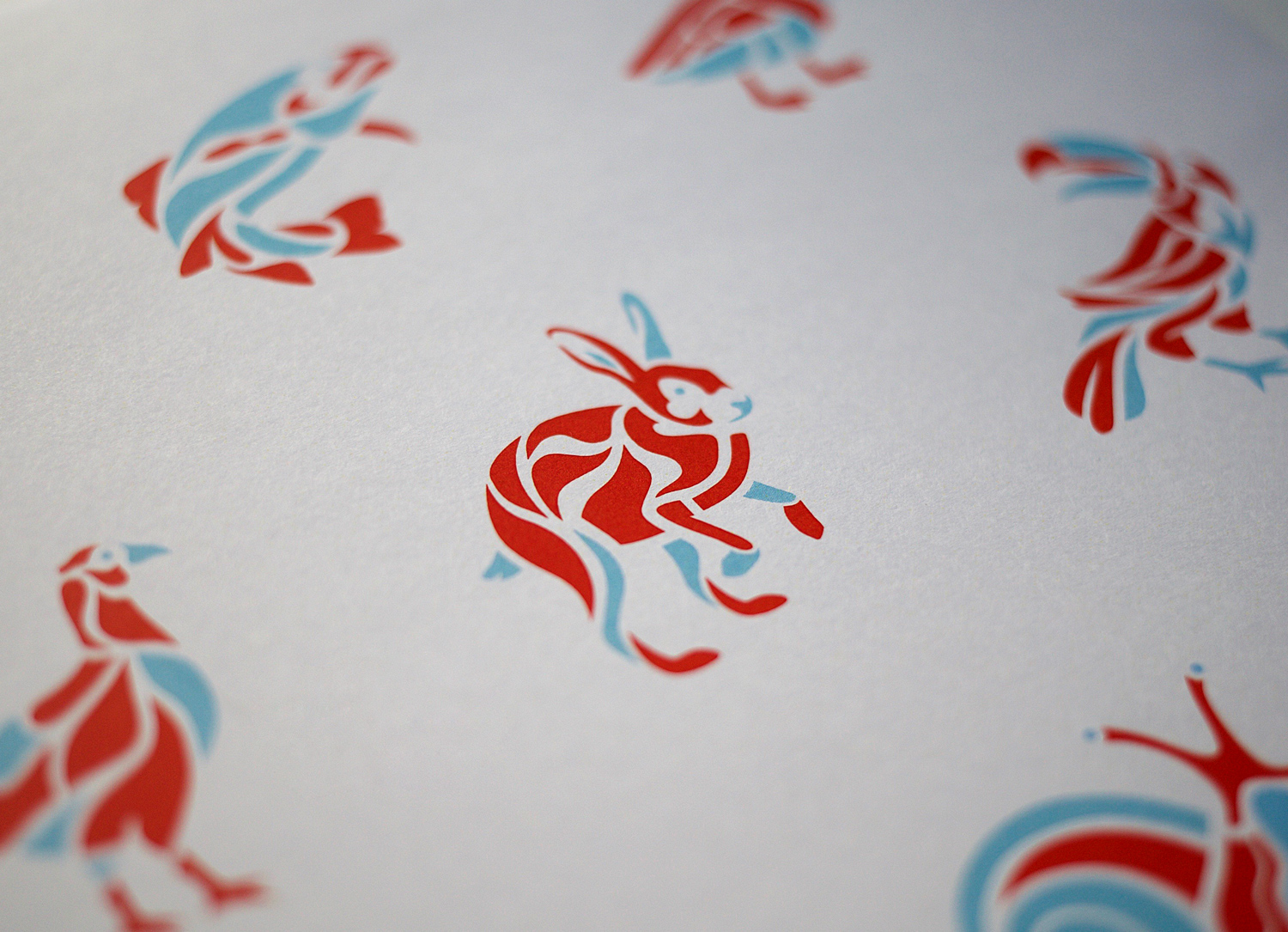
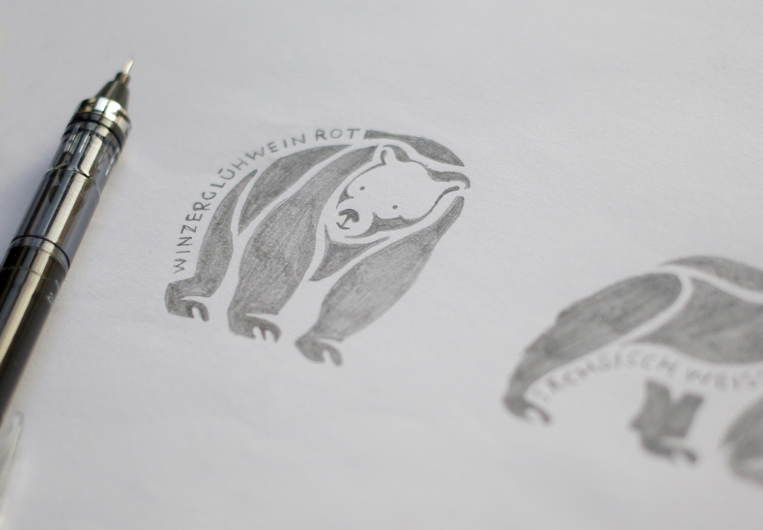
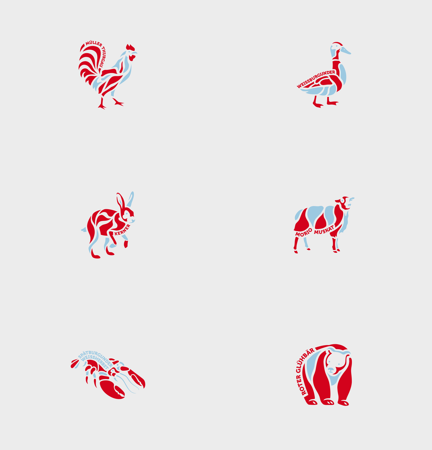
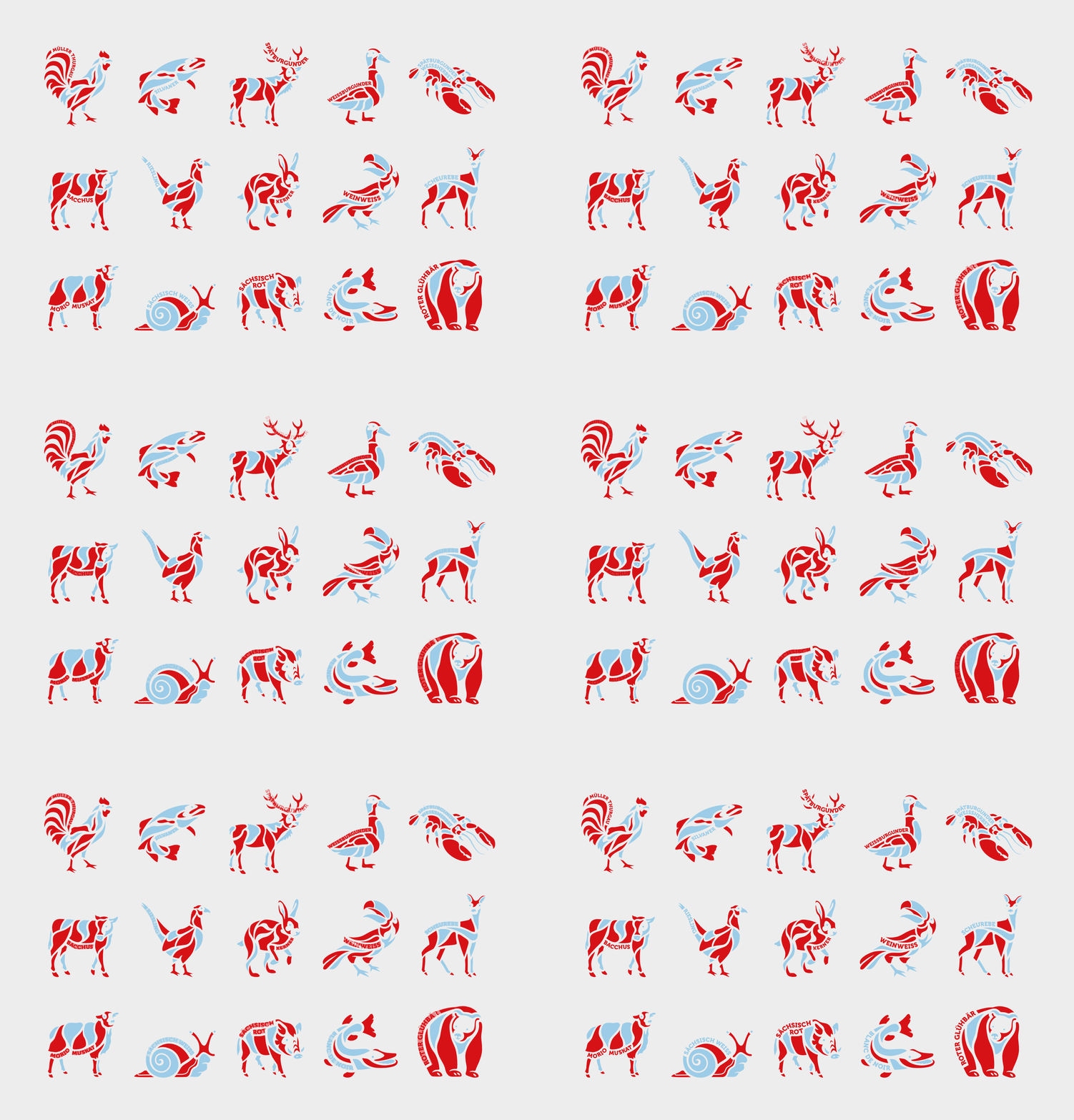
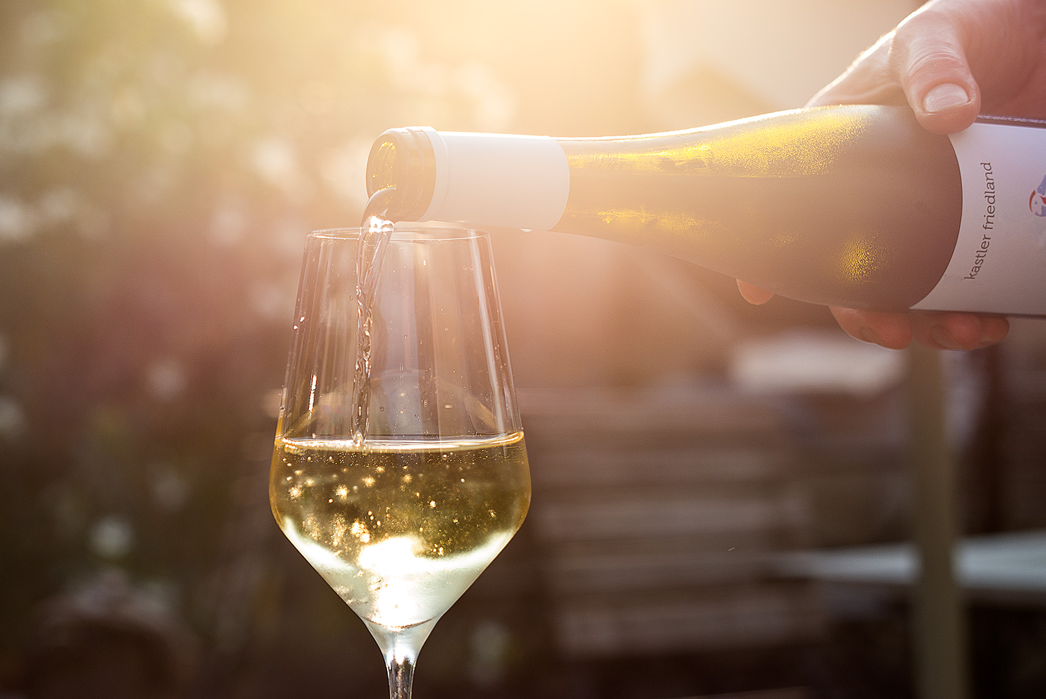
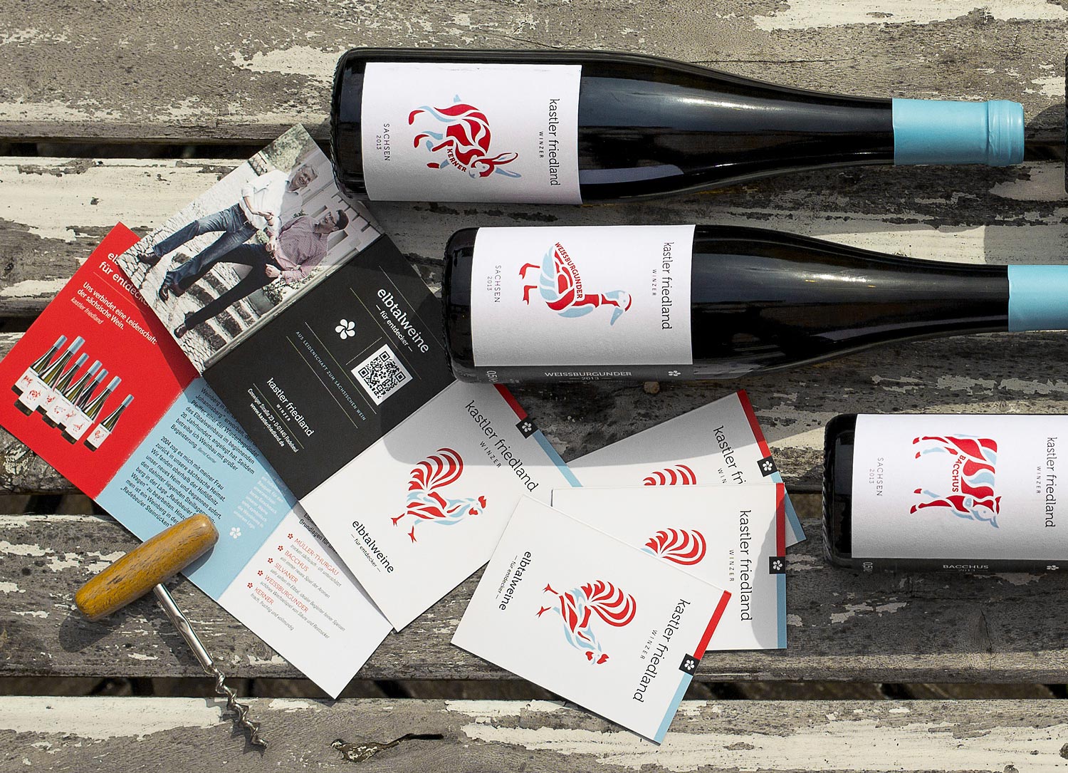
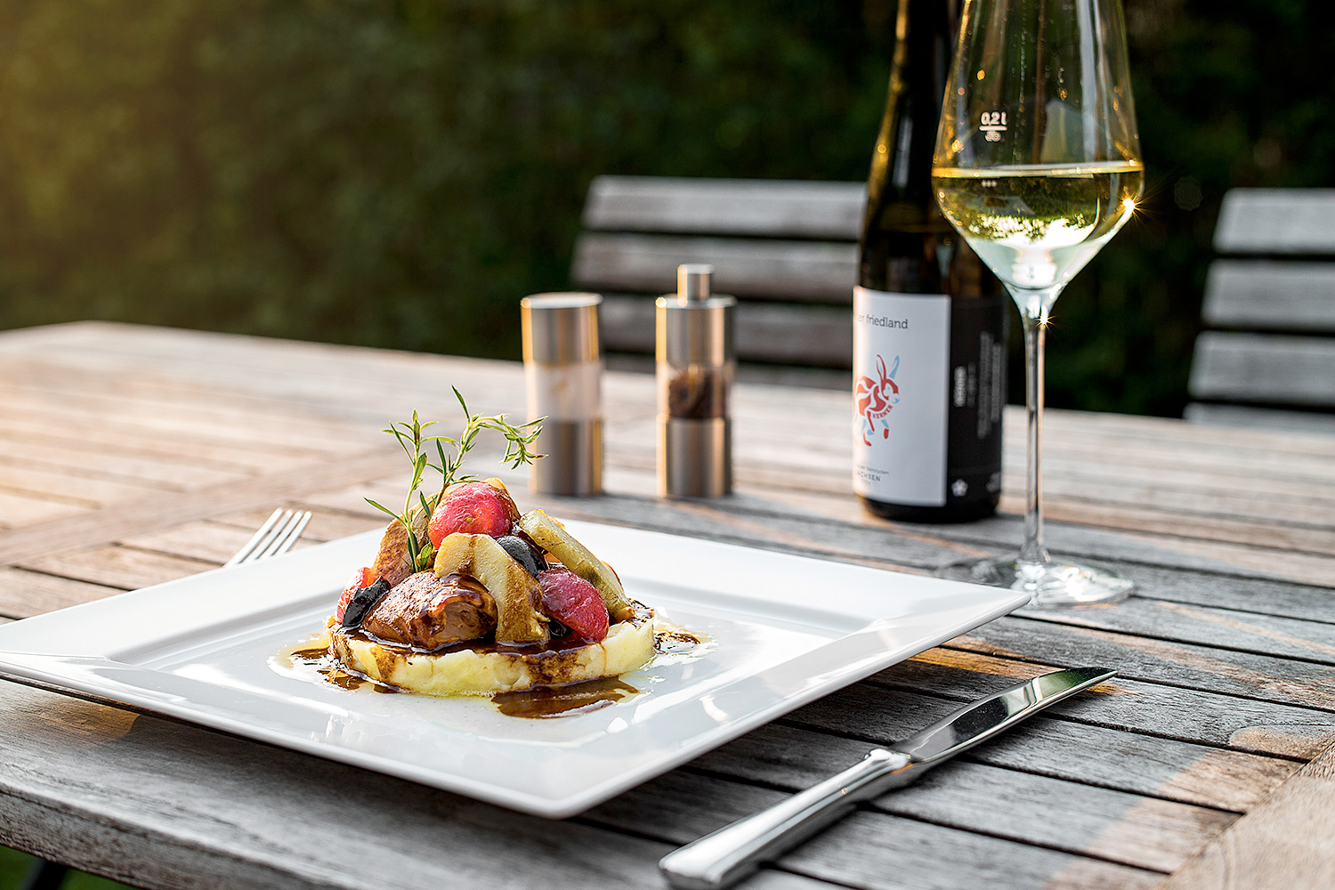
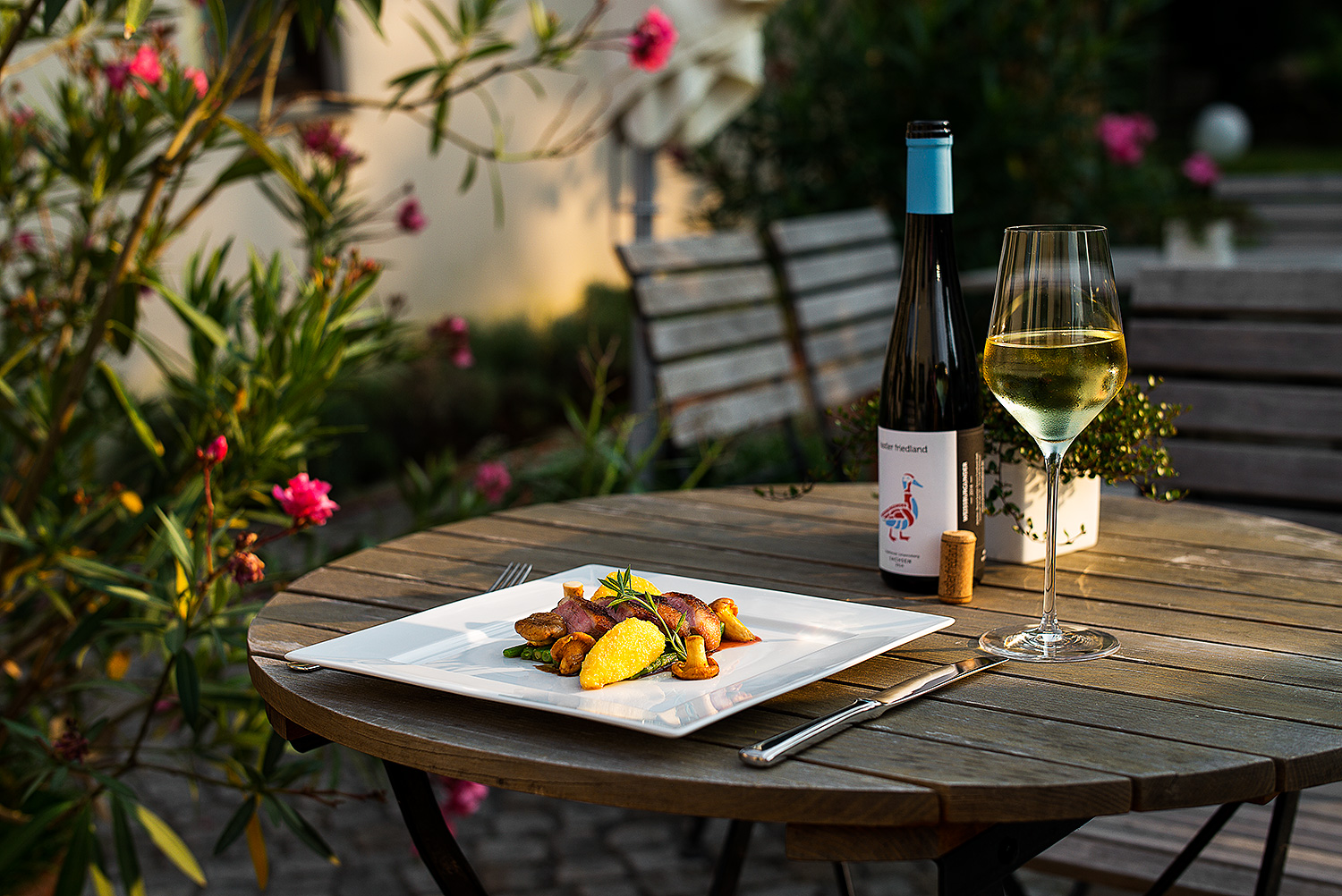
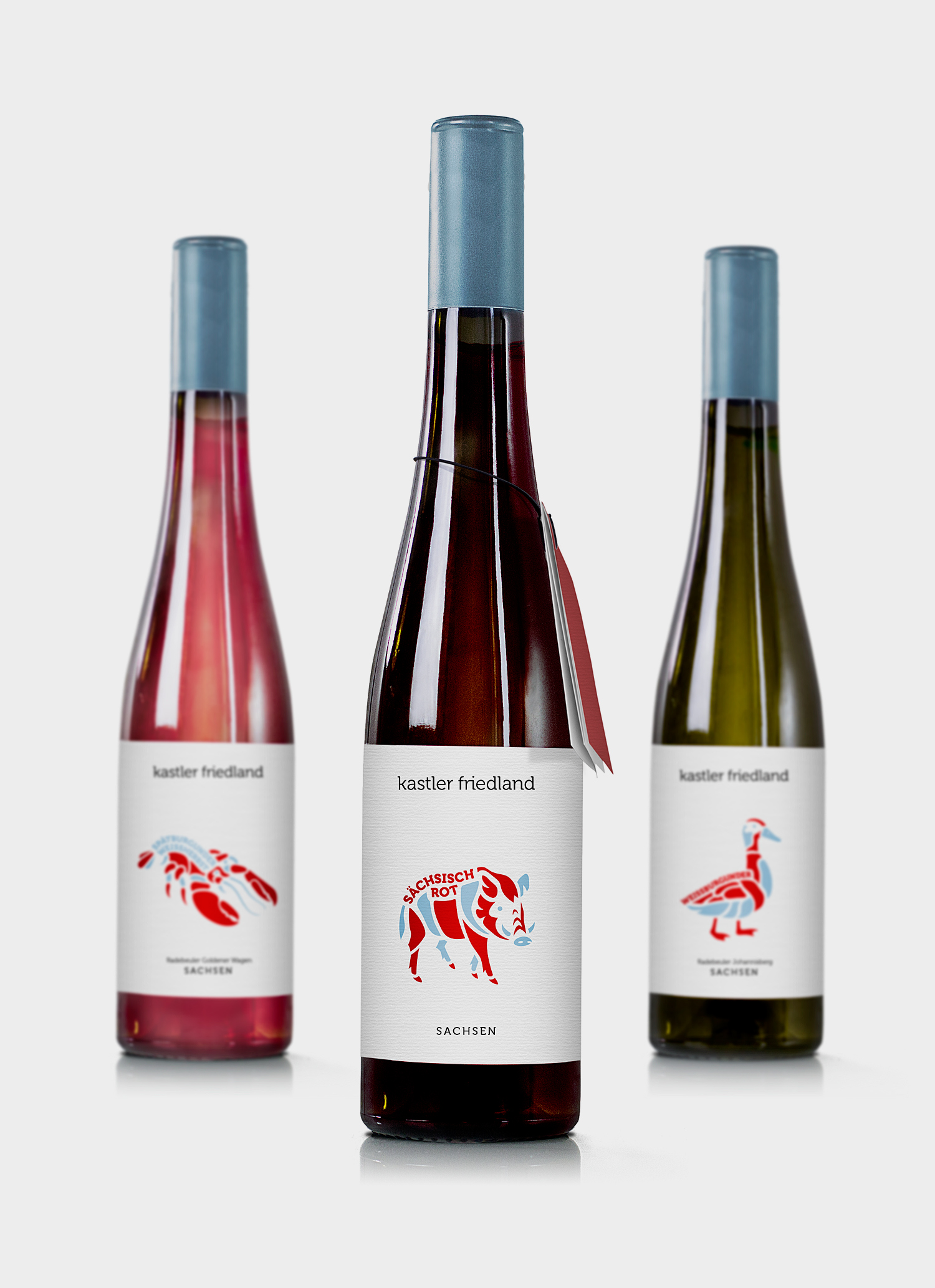
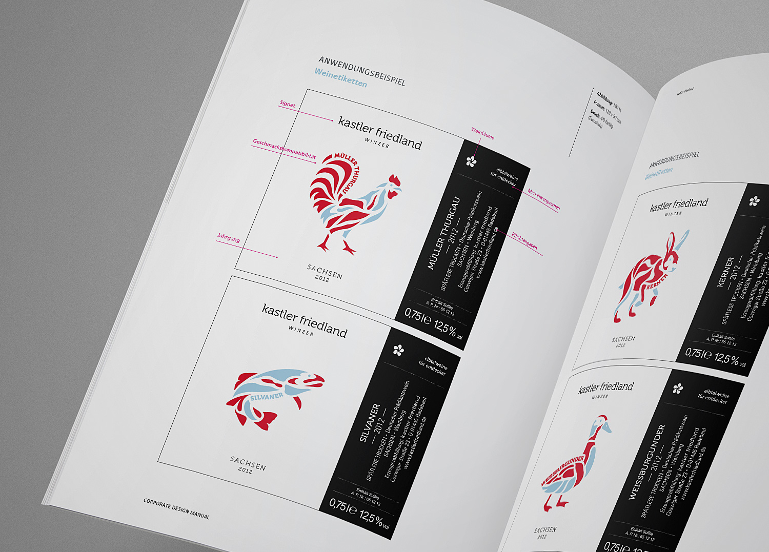
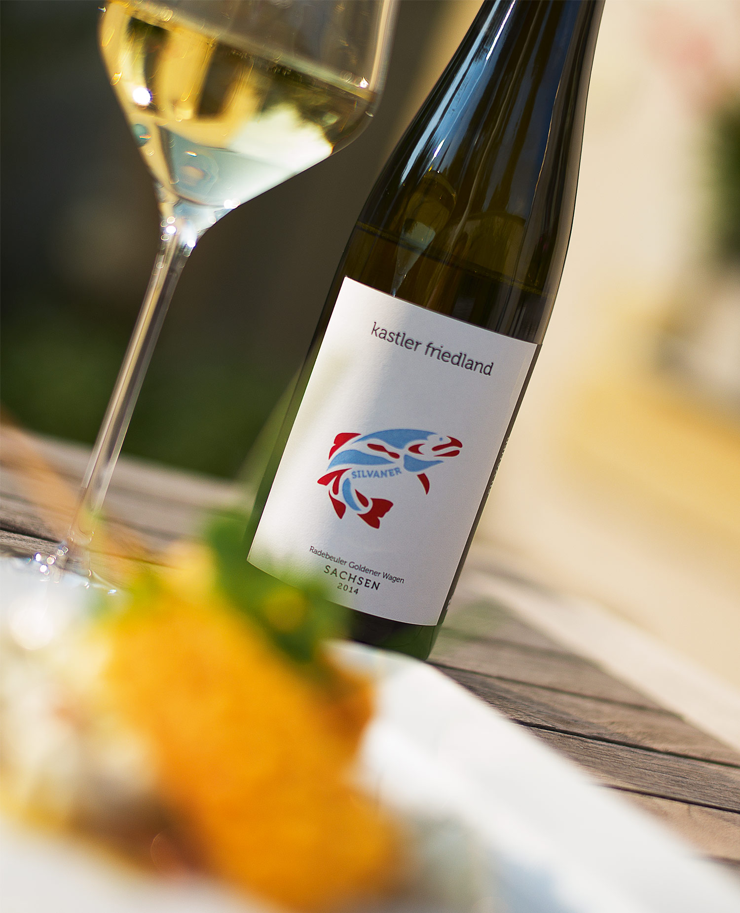
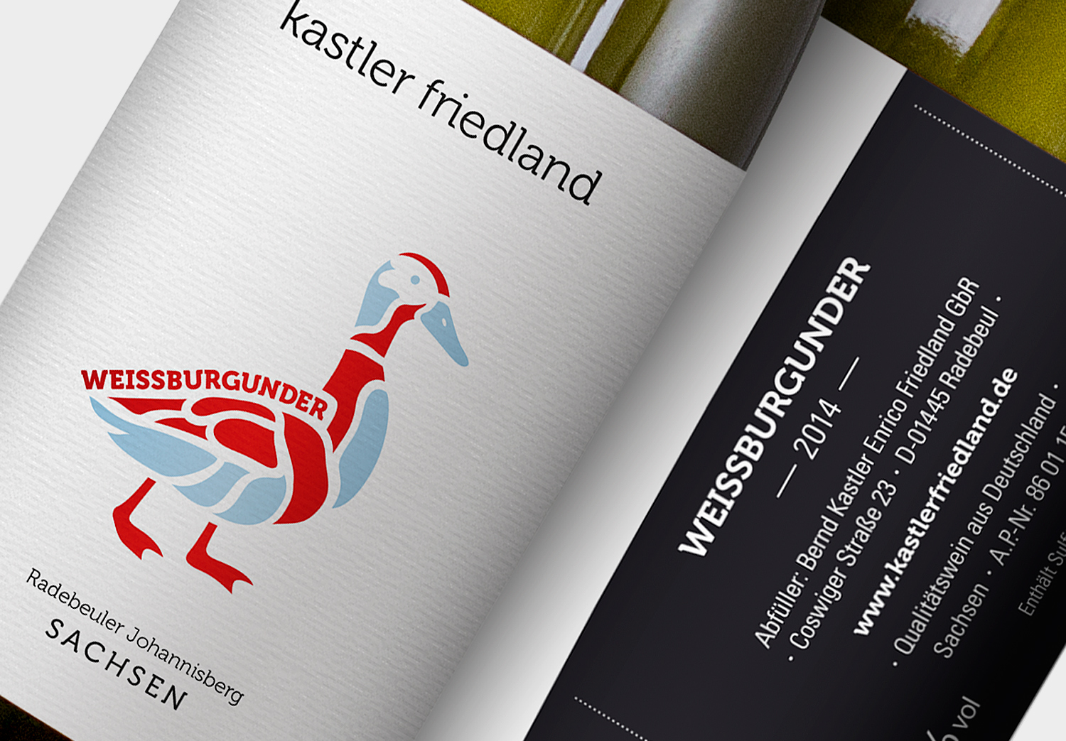
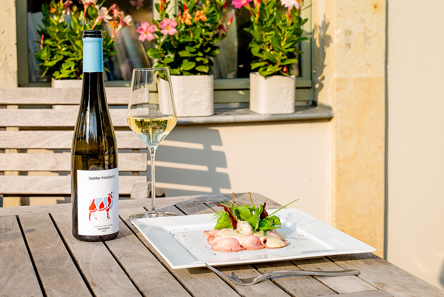
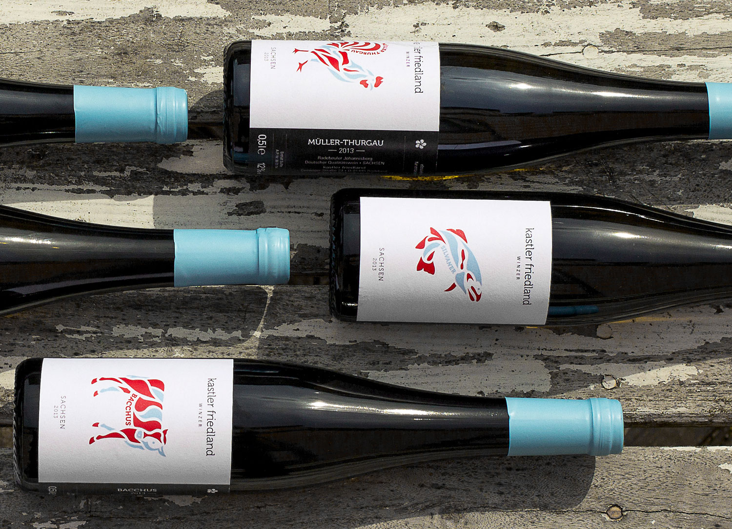
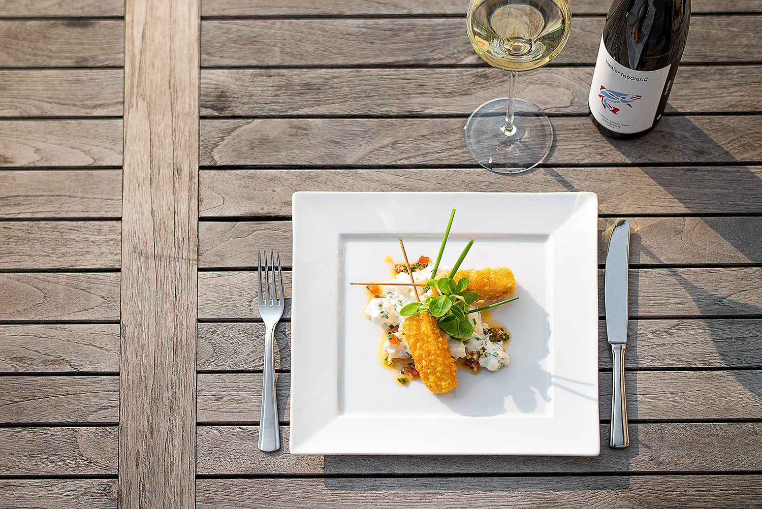
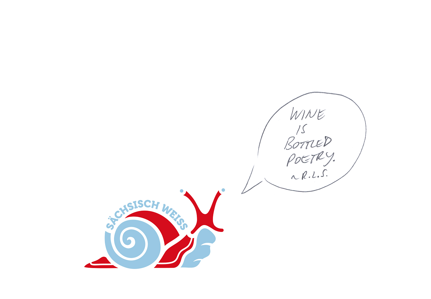
Enrico Friedland and Bernd Kastler have a common passion: the Saxon wine. We got to develop the brand identity for the winegrowers as well as their visual identity including brand guidelines, visual language with new photography, type and color palettes and brand packaging. Concept for the brand packaging based on the typical colors red and bright blue of the Radebeuler Winzerzug and combines the most important informations of the wine needed within one single illustration. Most noticable in the first place is the animal and its kind which shows the individual food recommendation for the wine. Included into the animals body is the grape variety. Finally the amount of red or blue that the animal has shows if its a red or white wine that you are getting. Well, have fun discovering the different wines and animals and like the snail of the Sächsisch Weiss would be saying: >> Wine is bottled poetry. << ~ by R. L. S.
CREDITS
Client: Kastler Friedland
Agency: ART ARMINUM
Discipline: Art Direction, Illustration, Brand Packaging, Graphic Design
Photographs: Julius Erler
URL: kastlerfriedland.de
